How to Create Cinematic Photo Looks
Break down the key ingredients of cinematic color grading: split toning, film fade, controlled contrast, and lens effects. Step-by-step guide with examples.
How to Create Cinematic Photo Looks
“Cinematic” is one of those words that gets thrown around a lot. But what does it actually mean when applied to photography? And more importantly, how do you get that look?
Personally, I’m drawn to anything that feels analog. Contrasty, with character. Not a specific signature look I apply to everything, but a general direction: if the photo feels like it could have been shot on film, I’m happy. 🎥
What makes a photo look cinematic?
Cinema has over a century of visual language. When we say a photo looks “cinematic,” we’re usually referencing a few specific characteristics:
- Restricted color palette: films don’t use every color equally. They commit to a palette: teal and orange, warm earth tones, cool desaturated blues.
- Controlled contrast: not blown out, not flat. A specific mid-range contrast that gives depth without losing shadow detail.
- Lifted blacks: pure black rarely exists in cinema. The darkest areas are dark gray, often with a subtle color tint.
- Widescreen framing: the aspect ratio itself signals “cinema.” A 2.39:1 crop immediately changes the mood.
- Lens characteristics: subtle halation, bloom, or chromatic fringe that come from real cinema lenses.
Step by step: building a cinematic grade
Let’s build a cinematic look from scratch. Follow along in Spectral:
Step 1: Set the foundation with exposure
Start with proper exposure. Cinematic images are rarely bright. They sit in the lower midtone range. Pull exposure down slightly (-0.3 to -0.5) and lift shadows (+10 to +20) to open up the dark areas without making the image feel bright.
Step 2: Shape the contrast
Don’t just use the contrast slider. It’s too blunt. Instead:
- Pull highlights down (-15 to -25) to control bright areas
- Lift shadows slightly (+10 to +15)
- This creates a compressed tonal range that feels more like film
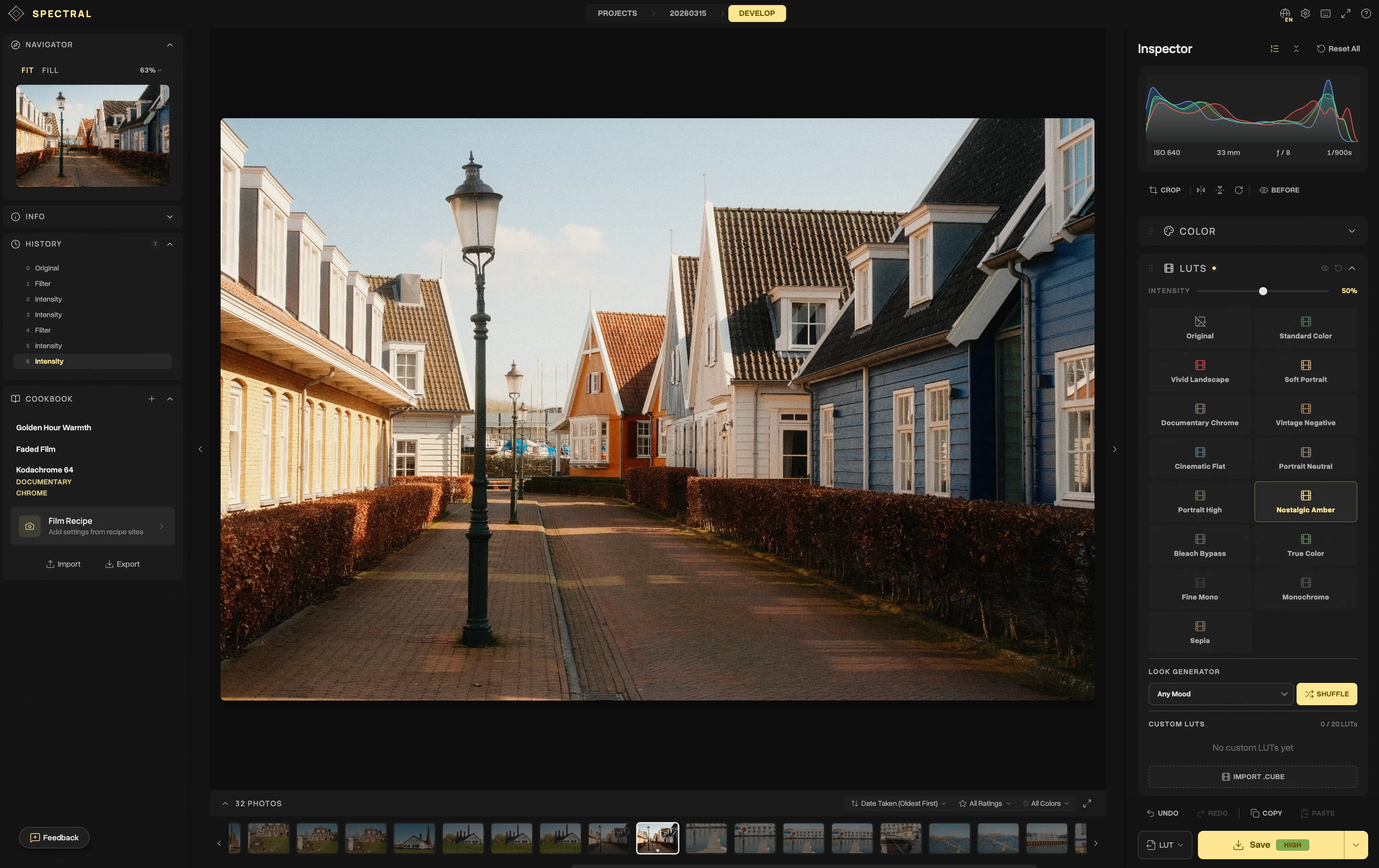
Step 3: Apply a film LUT as a starting point
Choose a LUT that’s in the neighborhood of your target look. In Spectral, the built-in options work well:
- Cinematic Warm for golden-hour and indoor scenes
- Cinematic Cool for moody, blue-tinted scenes
- Classic Chrome for a neutral-warm starting point
Set the intensity to 50-70%. You’ll refine from here.
Step 4: Split toning with curves
This is where the magic happens. Open the per-channel curves:
Blue channel: lift the shadow point. This adds blue into the dark areas, creating that signature teal-shadow look. Then slightly pull down the highlights to add warmth (yellow) to the bright areas.
Red channel: a very subtle lift in the shadows adds warmth to keep skin tones from going too cold.
Step 5: Refine with HSL
Target specific color ranges:
- Orange hue: shift slightly toward red for warmer skin tones
- Blue hue: shift toward teal for that indie film look
- Green saturation: pull down for a less “digital” feel in foliage
Step 6: Add film effects
This is optional but adds authenticity:
- Film grain: set to weak/medium. Grain breaks up the digital smoothness.
- Halation: a subtle amount (10-15) adds warm glow around bright areas, mimicking real film.
- Vignette: darken the edges slightly (-10 to -20) to direct the eye to center.
Step 7: Crop to widescreen
Use the crop tool to apply a 2.39:1 or 16:9 aspect ratio. The wider frame immediately triggers a cinematic association.
Common mistakes
Going too far with teal and orange
The teal-and-orange look is a meme at this point. Use it subtly. Real cinema uses this palette, but not as aggressively as most tutorials suggest.
Too much grain
Film grain should be felt, not seen. If someone notices the grain before the subject, it’s too much.
Forgetting about the subject
Color grading serves the image, not the other way around. If your grade draws attention to itself rather than enhancing the subject, dial it back.
Save and reuse your look
Once you’ve built a cinematic grade you love:
- Save it as a Cookbook recipe in Spectral
- Apply it to other photos with one click
- Export it as a
.cubeLUT to use in video editing software - Share the recipe JSON with other photographers
Consistency is what separates casual edits from a deliberate visual style. I don’t have one locked-in signature look, but I do lean toward the same direction: analog, contrasty, with warmth. Having a few saved recipes means I’m not rebuilding that from scratch every time.