Understanding Tone Curves for Better Photos
The curves tool is the most powerful adjustment in any photo editor. Learn how to read and use RGB curves to transform your images.
Understanding Tone Curves for Better Photos
If you could only have one adjustment tool, it should be curves. Every slider in a photo editor (exposure, contrast, highlights, shadows) is just a simplified version of what curves can do.
What is a tone curve?
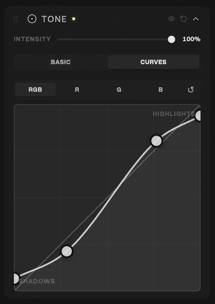
A tone curve is a graph where the horizontal axis represents the input tones (left = shadows, right = highlights) and the vertical axis represents the output (down = darker, up = brighter).
A straight diagonal line from bottom-left to top-right means “no change.” Every input tone equals its output. The magic happens when you bend this line.
The basics
S-curve: instant contrast
The most common adjustment. Pull the shadows down slightly, push the highlights up. This creates an S-shape that adds contrast. It’s the foundation of almost every film look, and personally, it’s where most of my edits start. I like my photos contrasty, and even a subtle S-curve immediately gives an image that analog punch. 📈
Lifted blacks: the film fade
Instead of the curve starting at the bottom-left corner, pull the shadows point up. This means your darkest tones become dark gray instead of pure black. This is the signature look of faded film and is instantly recognizable. Combined with a gentle S-curve, you get contrast with character: punchy but not harsh.
Crushed highlights: matte look
Pull the top of the curve down so the brightest areas become slightly dimmer. Combined with lifted blacks, this creates a compressed tonal range that feels analog and muted.
Per-channel RGB curves
This is where curves become truly powerful. Instead of adjusting overall brightness, you can adjust the red, green, and blue channels independently.
Red channel
- Pulling up the shadow point adds red/warmth to dark areas
- Pulling down the highlight point adds cyan/cool to bright areas
- Classic split tone: warm shadows (lift red) + cool highlights (pull red down)
Blue channel
- Lifting the shadow point adds blue to shadows (very cinematic)
- Pulling down adds yellow to highlights (warm, golden look)
- This is the single most impactful channel for creating a cinematic mood
Green channel
- Usually needs the least adjustment
- Lifting adds green (usually unwanted)
- Pulling down adds magenta (can warm skin tones but use sparingly)
Practical recipes with curves
Warm cinematic look
- RGB: gentle S-curve for contrast
- Blue channel: lift shadows (+15), pull highlights (-10)
- Red channel: lift shadows slightly (+5)
- Result: warm highlights, slightly cool shadows, gentle contrast
Faded film look
- RGB: lift the black point to about 15%
- Blue channel: slight S-curve
- Green channel: very slight lift in shadows
- Result: faded, desaturated, nostalgic
High contrast dramatic
- RGB: aggressive S-curve
- Blue channel: pull highlights down strongly
- Red channel: slight lift across midtones
- Result: punchy, warm, dramatic
Tips for using curves effectively
Less is more
Small moves create natural results. A shift of 5-10 points on a channel curve is already significant. If you’re dragging points across half the graph, you’ve gone too far.
Use the histogram as a guide
The histogram shows you where the tonal information lives. If your photo is mostly midtones, focus your curve adjustments in the center of the graph.
Always check skin tones
When adjusting channel curves, glance at any skin in the image. Human vision is extremely sensitive to unnatural skin color. If skin looks green or magenta, dial back the green channel.
Combine with other tools
Curves set the foundation. HSL adjustments refine specific colors. Film LUTs add character. Use them together, not as alternatives.